The Anatomy of an Optimised Ecommerce Product Page
No matter how well you market your ecommerce brand or how many visitors you drive to your website, without an optimised product page, it’s unlikely you’ll generate sales. An optimised product page is one that is designed to both be found by search engines and convert website visitors into buyers.
While search engine optimisation of product pages is a crucial element of product page success, for the purpose of this blog, we will focus on the visual elements and user experience factors that ensures you convert browsers into purchasers when they reach your product page.
Product page layout, design and user flow is the focal point of the ecommerce experience you provide your prospects. Facilitate conversions by following the below 6 steps to create an optimised ecommerce product page.
1. Images
The most important part of your product page, images are the first thing that showcase the product and capture the attention of browsers. For your feature image, make sure to use a high – quality shot with a light or white background, after all, this will be most likely the first thing browsers view and click/zoom in on. At this point, it’s about peaking your visitor’s interest in the product and wanting them to find out more information.
Which leads us on to the gallery of product photos. Following the feature image, an interested browser will likely pursue onto the product image gallery to learn more. Similar to the feature image, gallery photos should be clear, high quality and used to showcase all the relevant angles and features of the product not visible in the main image.
Today’s buyers are smart. They like to have a complete and clear understanding of a product before purchase to avoid making the wrong choice or going through the returns process. A 360-degree shot is a great way to provide a detailed overview of all product features and clear any doubt in the mind of the buyer.
.png?width=640&name=John%20Lewis%20Image%201%20(amended).png)
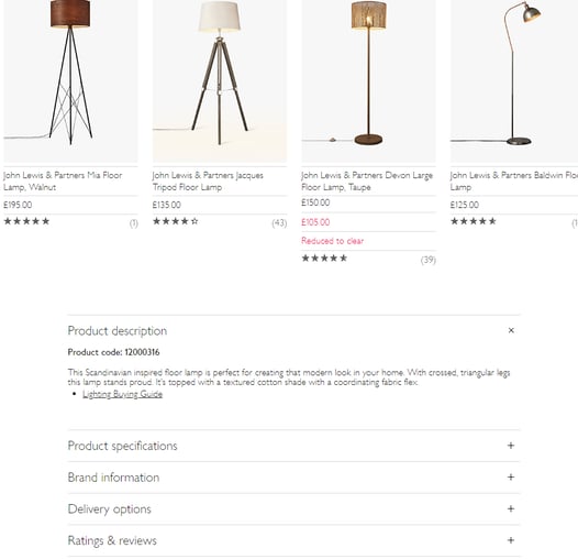
John Lewis & Partners product page; optimised featured image, image gallery, product title & overview and product description link.
2. Product title & overview
Make sure to provide all the important product information front and foremost where browsers will clearly see it (ideally, above the fold as much as possible). Product overview information should include the title, price, features, customisation options (colours, sizes etc.) and a call to action (CTA).
Blog: 5 Best Ecommerce Payment Gateway Providers
3. Product description
Product pages is where the selling happens, but you can’t expect to sell if your products aren’t enticing browsers to make a purchase. What makes your product unique? Create a description that paints the best possible picture of your product and provides browsers with a rounded overview of what you have on offer.
If you offer product variations; different sizes and colours, create a positive customisation experience for users. Seamless customisation options on the product page sidebar (or wherever looks best, as long as its clearly visible), make the process straightforward for the customer, reducing the chance of drop off.
4. Product suggestions
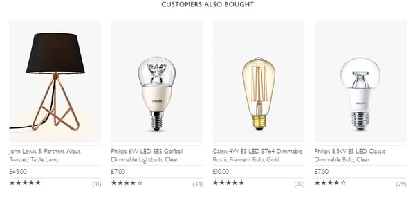
Now that you’ve got your visitors attention, keep them engaged by suggesting similar, complimentary or related products based on the product they’re currently viewing. Product recommendations offer browsers a similar experience to what they would experience if they were walking around a physical store, except with an extra splash of personalisation. Fashion brand ASOS, use similar products and 'buy the look' to personalise their shopping experience.
There are countless ways to segment products and showcase the perfect mix of recommendations to shoppers.
Two such strategies include:
Similar items -> A great option when a product is out of stock or to highlight other options customers may like. When product is out of stock, don’t risk losing customers to elsewhere, instead, promote a similar item that they may be interested in to keep their attention.
Complimentary products -> Upsell products that complement the item a shopper is currently viewing. For example, clothing stores can enable customers to shop an entire outfit/look at once while beauty brands can encourage visitors to buy makeup or skincare products that work best together.
Learn more about ecommerce personalisation strategies.

John Lewis & Partners; Product suggestions
5. Reviews
Product reviews build trust and trust boosts conversions. Studies suggest that a large proportion of online shoppers consult reviews before making a purchase, seeking reassurance before completing a sale. A review system validates your brand, boosts your authority and assures website visitors that your brand is reputable. An unbiased, third party product insight from a third party (i.e. previous user), often answers some common questions and doubts a purchaser may have.
Now, how do you start generating reviews? You can encourage customers to share their experience by building email campaigns that reaches out to users a week or two after they’ve received their product. It can also be worthwhile to use an incentive such as a discount code or special offer to entice customers to take the time to submit their review.

John Lewis & Partners; Product ratings & reviews
Read -> How to increase sales with an Instagram ecommerce strategy
6. Site speed
Ecommerce brands today are expected to create a speedy and seamless user experience to keep visitors engaged and encourage conversions. User experience (UX), is impossible without impeccable product page loading times. With consumers expecting page load times within 2 seconds or less, any longer and ecommerce sites risk visitors dropping off and losing out on sales to competitors.
A poor user experience can affect a user’s perception of your brand, not only reducing sales but also decreasing the chance of returning to your site in the future. Impress your visitors with speedy website loading times and your ecommerce site will become a revenue generating machine!
No matter how well you market your ecommerce brand or how much traffic you drive to your website, without an optimised product page, it's unlikely you'll convert browsers into buyers. It's important to create a stand out, flawless and easy shopping experience for users, enticing them to make a purchase, recommend your brand and return to your online store again in the future. By following the above 6 steps, you will successfully create a product page that generates sales for your ecommerce business.
