5 of the best B2B websites
Web design and development has drastically evolved in recent years and todays B2B websites have evolved with it. Using advanced functionality to captivate and convert visitors into leads as well as advanced design practices to stand out against the competition.
According to to Hubspot, traditional B2B websites tell potential customers three things: “who we are, what we do, and how we help.”
For B2B brands, your website is the best sales tool at your disposal but with over 644 million active websites1, it can be hard to stand out. We’ve explored the web and hand-picked 5 of our favourite B2B websites to share with you…
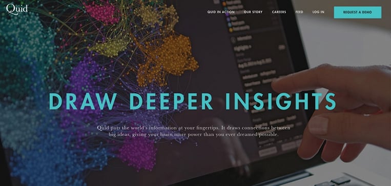
Quid
Who are they? Content software company
Why we love it: Functional minimalism
Quid is a perfect example of a site incorporating functional minimalism. By only using the essential elements on-page, this design not only helps UX but also enables faster load time and better readability, while adding an air of sophistication. Their clever use of colour, graphs and tables also make understanding its complex software much easier.
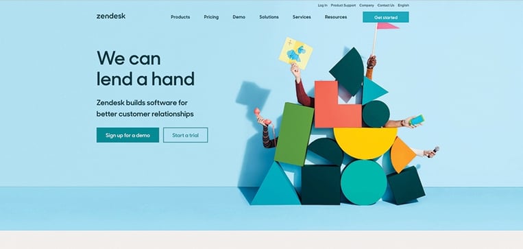
Zendesk
Who are they? Customer service software provider
Why we love it: Use of animation
Zendesk have done an impressive job including subtle, yet advanced, animations across their site. When you visit their website you instantly feel the fun and playful persona of the company. Their animation uses simple shapes with bright colours, similar to the building blocks that young kids play with. Not only do they improve user experience and draw attention, they help establish a personality for the company which can sometimes be difficult to do as a software service company.
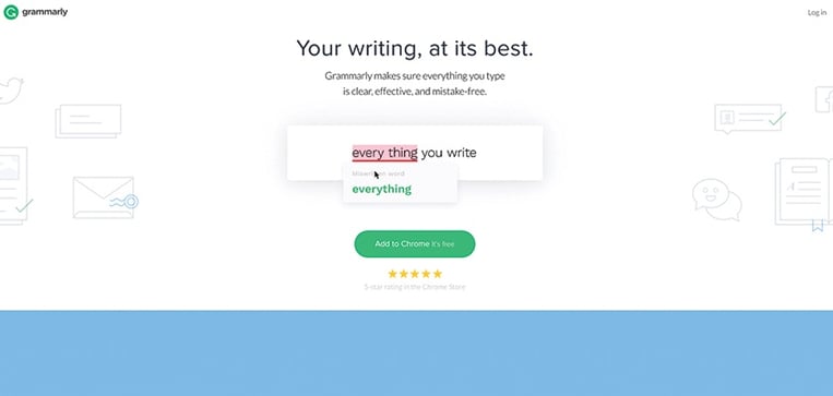
Grammarly
Who are they? The world’s leading automated proof-reader
Why we love it: Flat design & animation
Although we’ve singled Grammarly out for their use of flat design and animation, that’s not the only reason why we love their site; Long scrolling and functional minimalism are also features that they utilise fantastically, however it’s their flat design and animation that are the icing on the cake. Filling up the entire screen, this design also aids load time and responsiveness for mobile devices. In addition, their clever animation serves as a product demo, giving you a clear idea of their product and how it works. As you scroll down the page, you see all the services that the product provides and how it can improve your writing.
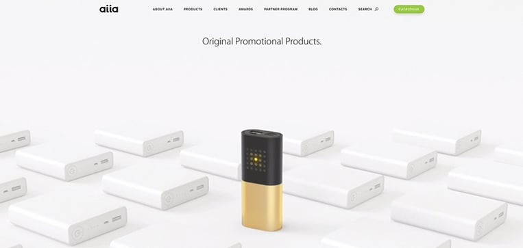
Aiia
Who are they? Branded promotional gadgets
Why we love it: Captivating Photography
One of our favourite examples, Aiia stood out for their use of product photography, particularly the brightly coloured backgrounds and nicely rendered images. The quality of the site design conveys the quality of the products, while functionality also steps up to the mark.
The website has a modern and energetic vibe and they capture their audience with a high quality product line. When you click on the particular product, a full-screen, background promo clip is triggered, which lets the visitor see the gadget in action
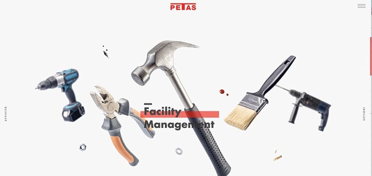
PETAS
Who are they? A construction company and facility management service
Why we love it: Engaging visuals
The PETAS site uses a unique display of visuals to engage and retain users. Distinctive landing pages consisting of several scroll screens, with various tools and construction equipment floating in the background, acting as one big live cover visual.
As a user, you are prompted to ‘juggle’ through all of the landings. You’ll find it difficult to leave the site until you’ve explored it all- a truly engaging approach.
So there you have it- 5 of the best B2B websites. Have you come across any great B2B sites lately? What is it that makes them so great? Drop us a comment below- we’d love to hear from you.
If you want to build a website that best represents your brand and engages your target market, check out these 7 critical website considerations you can't overlook.
Sources:
1 Business Insider